


A lot of information!
When we talk about climate change, we use lots of information, or data. We look at the temperature at different places around the world. We pay attention to the amount of carbon dioxide in the air. We think about storms and sea level rise. How do we show all this information so everyone can understand it?
Graphs are a great way to take lots of information and make a picture out of it. Imagine if someone showed you data that looked like this:
That doesn’t really make any sense. It’s hard to understand. But what if someone showed you a graph like this one from the National Oceanic and Atmospheric Administration?
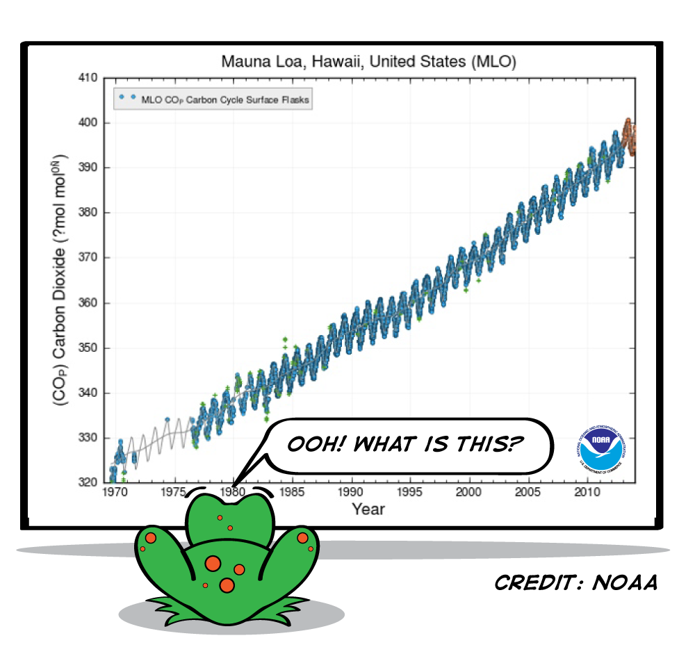
We can learn a lot from this graph, but we need to take it one step at a time. What should we look at first?
1. Look at labels
Look at the bottom and the left edge. What things are being recorded here? The bottom says “year.” It starts at 1969 and goes to 2014. That means the blue line represents something that happened over the last 45 years.

How do we know what the blue line represents? We look at the label on the left side of the graph. It says “Carbon Dioxide,” which means the blue line is showing how much carbon dioxide there was in the air. The higher the line goes, the more carbon dioxide there was.
We can also see from the top that these measurements were taken in Mauna Loa, Hawaii.
2. Look at lines
Now we can look at the actual information on the graph. What do you notice about that line? It starts low on the left side, and it goes up from there, but not smoothly. Every year there is a zigzag—a high point and a low point. But you can see that even though each year goes up and down a little, over the course of many years, you can see the whole line move up.
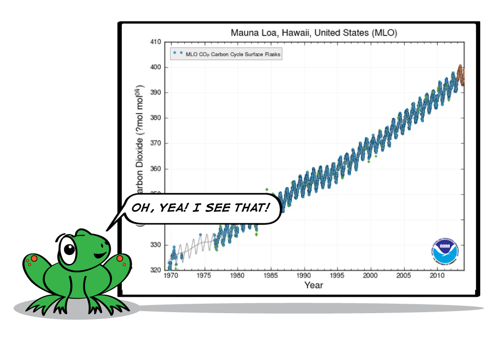
3. Find meaning
What does it actually mean? This graph shows that the amount of carbon dioxide in the air in Hawaii has been slowly and steadily increasing for the last 45 years.
4. Think big
Why is this important? Carbon dioxide is a greenhouse gas. Too much of it in the air is dangerous for the Earth. The information in this graph is evidence for climate change.

5. Take steps
Now what do we do? You can learn more about climate change by reading about the greenhouse effect, sea ice, and why carbon dioxide can be dangerous. You can also find out what you can do to help.


